

Scientific
and creative.
and creative.
We cannot show any Rx projects here for legal reasons. We will gladly provide further references on request.
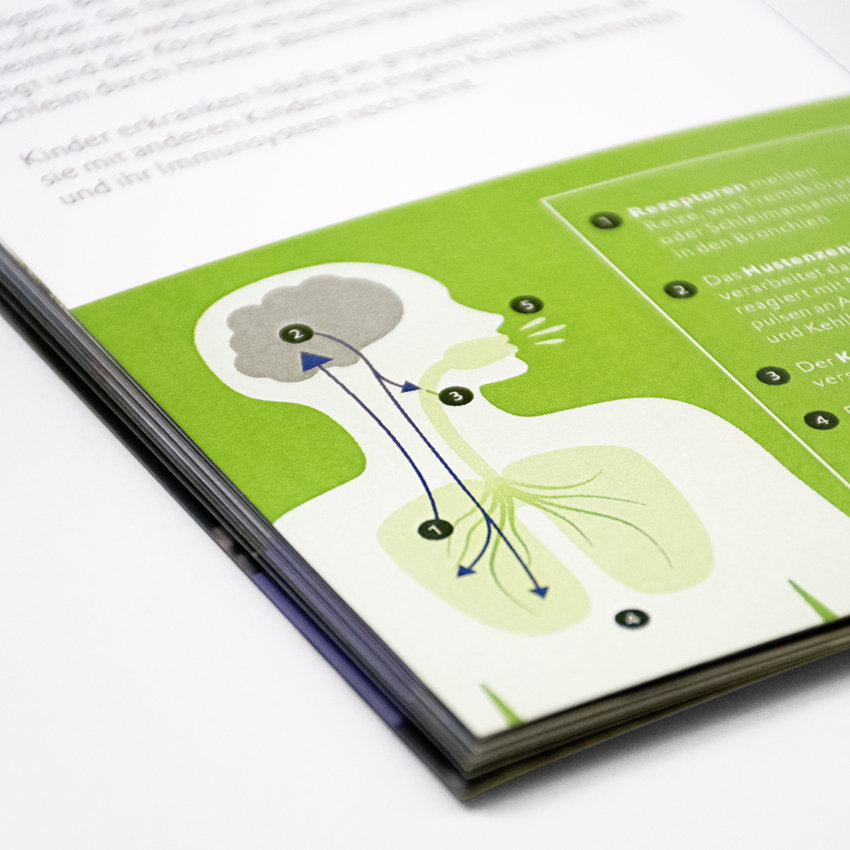
Since 2021, we have been developing a guide series on various health topics for Zeller AG.
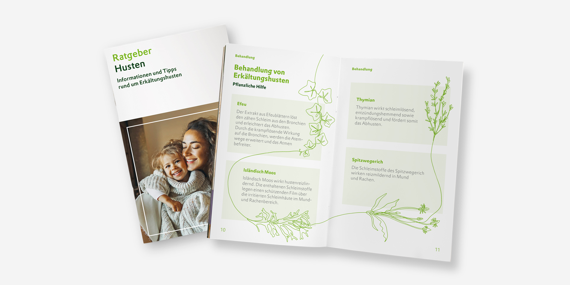
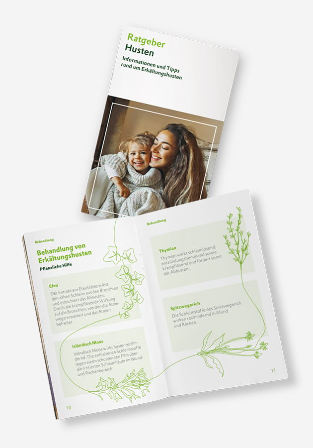
The guides are distributed in doctors’ practices, pharmacies and chemists, and support those affected with reliable information, practical tips and further assistance.

Challenge
Health issues such as PMS, stress, atopic dermatitis, sleep disorders or coughs often raise many questions. Those affected are looking for clear explanations and specific courses of action. At the same time, the content must be factually accurate and appealing to different target groups.
Solution
STO Pharmawerbung devised a new, standalone design concept that works across all topics and gives the entire guide series a consistent look. A clear visual language, striking images of patients and complementary illustrations create brand recognition and convey medical content in an accessible, vivid and inviting way.
The Cardiovascular Manual is a reference work for specialists. It is published by the Cardiology Clinic of the Cantonal Hospital of St. Gallen.


Since 2011, STO Pharmawerbung has been in charge of the biennial revisions and is responsible for the concept and layout of the manual.

Challenge
The Cardiovascular Manual is updated every two years to accurately reflect the current guidelines. The current 38 chapters, totalling 373 pages, are written by several different main and sub-authors. How do we keep track of everything?
Solution
With the help of an internal project management tool, STO Pharmawerbung ensures that it is clear to everyone at all times who is currently working on each chapter and what stage it is at. All data is stored compactly in one place and the work steps are traceable. This greatly reduces correction loops and floods of emails. In 2025, the result will be the 9th edition of the Cardiovascular Manual with 3,500 printed copies and a high level of customer satisfaction.
Early identification of cognitive changes — structured, practical, and patient-centered.
The toolkit, developed in collaboration with our client OM Pharma, supports primary care physicians in identifying subjective cognitive decline (SCD) at an early stage, recognizing risks, and determining appropriate next steps together with patients.


Clearly structured and easy-to-use materials enable integration into everyday practice without taking up too much time and create a reliable basis for follow-up checks and therapy decisions.

Challenge
Around 80% of people with subjective cognitive decline (SCD) remain undiagnosed. Those affected report declining cognitive performance, even though tests often show no abnormalities. At the same time, SCD can be an early warning sign of developing dementia. It is difficult for general practitioners to classify, as the causes range from aging processes to mental stress and lifestyle factors. In addition, there is often a lack of time for in-depth assessment and structured discussions.
Solution
Together with OM Pharma and leading experts in neurology, neuropsychology, and geriatrics, we designed and implemented a structured set of analog tools that facilitate early detection, support individualized measures, enable the progression of the disease to be documented, and facilitate empathetic communication. This allows the topic of cognitive health to be integrated into general practice at an early stage in a systematic and patient-centered manner.

Customers


Open and diverse – in our agency, everyone is welcome and gender doesn’t matter. In our use of language though, it does. All the wording chosen for this website is equally applicable to female, non-binary or male persons at the same time.